The project that I worked on for the class was the September 11 Digital Archive and honestly it is not a website that I would like to take much from. It definitely has its strenghts, such as with the amount of information it contains as well as having a myriad of people that were able to work on it, but it lacks a lot in terms of desing and effective use of its medium.
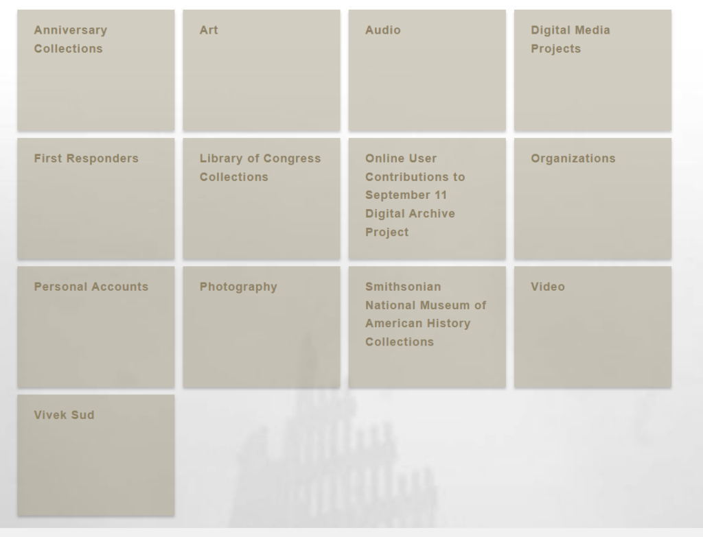
Considering that I want my project to be based on animators/directors in the animation industry, I want to be able to use a lot of visuals to help demonstrate just why they are so great. This involves dynamic visuals and creative ways of presenting the work, which the relativly monotone website for the September 11 Digital Archive does not do. There is not much contrast on their website, and there are not many interesting photos that draw you in. It is more like a website that is meant purely for information gathering/academic purposed and not so much for drawing its audience into the subject it’s discussing. However, I did enjoy the clear categories that were clear in its contents and well organized.
Another thing that I did like was its inclusion of video testemonies from the victims of 9/11 as it allowed for its audience to experience the information in a different medium and brought in an interesting primary source. I will consider adding in video interview clips from the directors I want to do my project about.

Leave a Reply